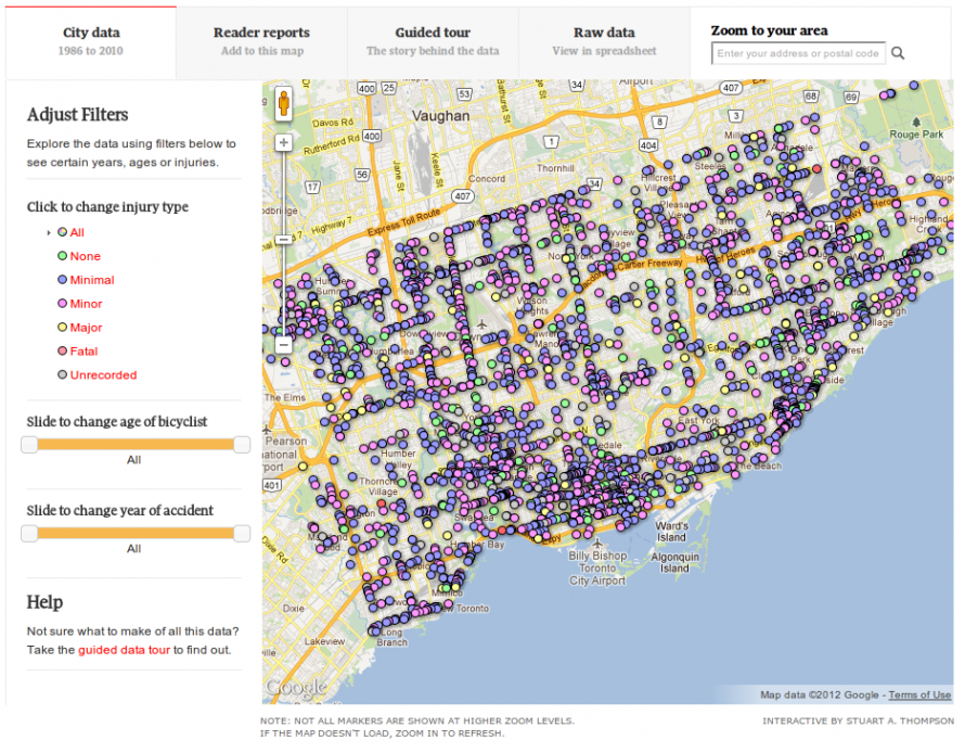
In this Globe and Mail produced interactive map of cyclists collisions from 1986 to 2010 there is a sea of pins representing reported collisions by cyclists and colour-coded for injury severity. It's a thing of beauty and nice to zoom in and out. But that soon gets old once you realize that there is little else that we can currently conclude from it. Can we tell if my route or neighbourhood is safer than another? Can we tell if cycling in Toronto has gotten safer over time? Not really. We are missing a key denominator - bike traffic. Not surprising since the City has only begun to collect this data in a more systematic manner. At the very least, the authors could try to explore some of the other interesting data in the dataset that they've hosted.
That doesn't seem to stop them from trying to reach some broad conclusions without all the information.
They claim: "Toronto falling behind pack in averting bicycle collisions, data reveals". Well, the data doesn't reveal that since you haven't compared the number of cyclists and bike trips over time and between cities. What are the cycling populations in each city? Have the number of bike trips grown or not?
The Globe and Mail claimed that 1987 is the "most dangerous year" at 1600 collisions, 1996 had about 1000 and since then it has averaged about 1200 per year. Maybe Toronto's bike collisions haven't dropped because we've got more and more cyclists. From 1999 to 2009 the percentage of cyclists grew from 48% to 54%, according to a cycling survey by the City. Since we know there has been a gradual growth in cyclists over the last decade and the number of collisions has stayed steady since 1996 it seems that the number of bike trips is increasing faster than the number of collisions. So I come to the opposite conclusion from the authors: the risk to Toronto cyclists - averaged out across the whole city - has gone down. I even dare say that over the last 10 years Toronto has gotten a little bit safer.
Comparing to other cities can make us feel better or worse about ourselves. It may even help to turn on the heat on politicians, but it doesn't help planners determine how or where to make things safer. Some streets or neighbourhoods might be safer, some more dangerous. We don't know until we get a breakdown of collisions and bike trips.
They are a bit more circumspect about the bike lanes on Jarvis: "In the Globe’s data, reports of cyclist injuries actually went up slightly in the six months following the installation of the Jarvis Street bike lanes – slated to be removed this year. However, the lack of complete data makes it nearly impossible to understand what caused the increase." It would have been helpful if they had at least also included the City's bike counts before and after the installation of bike lanes on Jarvis where they found that the number of bikes tripled. Stuart Thompson kindly responded to me with a tweet stating that injuries were slightly less than double on Jarvis after the installation of the bike lanes (I think he might have meant collisions).
If the number of cyclists tripled on Jarvis, but the number of injuries only doubled I would say that we are on to something good and it wouldn't be too much of a stretch to say that the bike lanes have actually reduced the risk of injury for cyclists on Jarvis.
What may be more useful is if someone compared other recorded characteristics of the collisions found in this dataset (presumably from the police): weather, time of day, crash type, injury severity, road surface (dry/wet) and road type. It's still a bit too generic, but it is more helpful. Transportation Services is already compiling some of this. Perhaps the authors will have time to explore the more interesting and helpful comparisons, and not make conclusions that aren't very conclusive.
Comments
Ben
Thanks for debunking this one
Fri, 02/03/2012 - 16:01Thanks for debunking this one Herb.