OpenFile has a young and bike-friendly group of journalists writing and researching for it. It has just produced a pretty cool map of traffic "accidents" called OpenRoad where people can choose start and end points of a journey to see the number of crashes along the way that were reported to the police. (I'm going to stick to calling them crashes since we don't know if they were actually accidents or if they could have been prevented). The Globe and Mail created a similar map not too long ago, using the same / similar data. I wrote up my criticisms of that map and most of the same criticisms stand for OpenRoad. OpenFile, in this initiative, is misleading the public more than they're helping. They've failed to provide context for the numbers and the whole project implies that they are helping people find the most dangerous intersections.
OpenFile is aware of the problem with the data and notes that "A route with more accidents isn't necessarily more dangerous for each individual on it." Popular cycling routes will inevitably have more crashes than routes where no cyclists venture. Their map is unable to tell us why an intersection has lots or few crashes. Is it because it gets used a lot by cyclists? Or does it have bad sightlines, heavy traffic, or lots of potholes? We have no idea based on their map.
It begs the question of the usefulness of the map at all if we can't even use it to help us make decisions on our routes.
With the one hand OpenFile explained the limitations of the OpenRoad map, but with the other hand they were exploiting it for headlines like "MONTREAL'S MOST DANGEROUS INTERSECTION FOR CYCLISTS" and a tamer headline "Vancouver’s intersection with the most bicycle-vehicle collisions", which still contained the statement "It will come as no surprise that Main Street at East 2nd Avenue, a hub of both bikes and cars, is the most dangerous cycling intersection in Vancouver with 10 accidents reported to police between 2007 and 2010".
No, that's not how it works.
The media now seems to be more interested in playing with cool new tools rather than consult with experts - in this case bike safety researchers - in order to understand how we can actually measure "safety" and "danger".
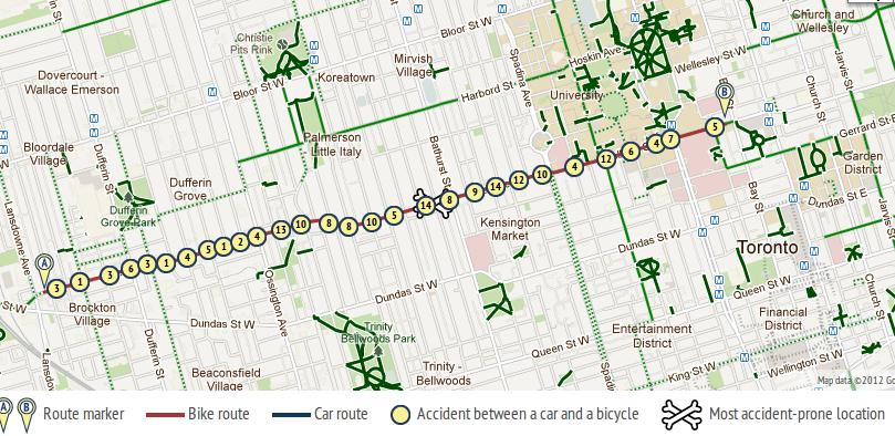
We don't have good cycling counts in Toronto. The best we have is the Downtown Cordon Count from 2010 but it will serve the purpose for my argument. Let's compare College and Dundas. The report counted the number of cyclists passing a cordon over the day and the western boundary was Spadina. Using the OpenRoad map I selected a route on College from Bathurst to Beverley and the same from Dundas. I then can make a rough comparison of crashes to the cyclist counts on these two streets.
| Street | Cyclists (per day) | Crashes (2007-2010) |
|---|---|---|
| College | 4722 | 65 |
| Dundas | 1394 | 30 |
There are 3 times as many cyclists on College as Dundas, but only 2 times as many crashes. (I am making what I think is a safe assumption that cycling traffic on College tends to always be about 3 times as high as Dundas). From the viewpoint of an individual cyclist which street would you think would mean less risk of a crash? Going by the OpenRoad map and headlines I would venture that OpenFile would proclaim Dundas as the safer street and College as more dangerous. College has twice as many crashes after all. But as soon as we take into account how many cyclists are actually travelling on these two streets College starts to look a lot better than Dundas.
Ideally in such investigative journalism it would be nice to have a map like this, which maps the pedestrian collisions with a denominator of pedestrian traffic. But we can't get that. So what is the point of OpenRoad?
OpenFile and the Globe and Mail have, at best, just provided yet another fun-looking but pointless widget, and, at worst, helped to persuade people to choose cycling routes that are actually more dangerous than their tool would tell them. Anyone up for biking on Steeles? It has a heck of a lot fewer crashes than College Street.
Comments
Matt Alexander (not verified)
It looks like some data is
Fri, 05/04/2012 - 12:48It looks like some data is there. Can we calculate the percentage of cycling trips on college who were involved in a collision and make a colour-coded map?
Ed
I think dismissing it as
Fri, 05/04/2012 - 15:57I think dismissing it as pointless is a bit quick.
I put in my start point and end point and it mapped my route correctly. I am pretty impressed as it's a 20 km commute from Long Branch.
I am not going to be looking at other routes, because this is the route I take.
It's interesting that the most dangerous part of my ride is on Lake Shore Boulevard through Mimico, and not Queen's Quay or Yonge St. On the other hand, I have heard of at least one cyclist going down badly when the TTC bus pulled out and forced the cyclist onto the streetcar tracks, with the usual unfortunate conclusions.
Queens Quay has a lot of riding too, so I conclude that I really should watch out along Lake Shore in the west end.
The issue that I see is that there are no accidents shown along the Martin Goodman Trail. In summer, I consider the trail to be the likeliest place to get into an accident. Not with a car, and almost certainly not fatal, but going down on the pavement or grass sucks even though it's a rollerblader and not a car that caused that.
anthony
The map is not entirely
Sat, 05/05/2012 - 00:58The map is not entirely pointless, as is there is some detail as to the nature of the collisions which occurred there when you click on the numbers.
Myself, I view it as a map of "hot spots," places where certain types of collisions are more likely to occur. Having this knowledge beforehand on a journey allows me to plan and prepare counter-measures (even if it's simply to look around and be more aware) as I approach and travel through these "hot spots". The details of the collisions should also act a reminder to avoid certain types of manoeuvres when riding as they are much more likely to result in a collision, like riding off of sidewalks into intersections.
herb
Matt: Something could be
Sat, 05/05/2012 - 16:32Matt: Something could be created but it would be fairly limited. We could show the relative risk of the streets close to the cordon, that is, close to Jarvis or Spadina. We wouldn't know the risk along the whole length of, say, College or Dundas.
Ed: The route picking is a feature of Google Maps and not of OpenFile per se.
Already you made an assumption that the most "dangerous" part of your ride is on Lake Shore Boulevard through Mimico. But how do you know that? If you are just counting the number of crashes on the map then you've made an assumption without basis. As I've noted already, if you haven't compared the crash numbers to cycling rates then you're not looking at it right.
Note that the data is coming from the police. Along the Martin Goodman Trail there are actually some collision reports listed. Each involves motorists where the trail crosses access roads. People are more likely to report a collision with motorists than otherwise.
Anthony: Good point. Looking at the different types of collisions can be useful at different "hot spots". It would be useful for OpenFile to colour code the collisions by type. Unfortunately they don't emphasis the collision type or give people any leads on how they could lower their risk.
Ed
Well, looks like there's a
Wed, 05/09/2012 - 10:23Well, looks like there's a bug. I think it stops calculating accidents after 10 km.
When I enter my commute eastbound from Long Branch, all the accidents are on Lake Shore.
When I enter it westbound from Yonge and Queen, all the accidents are east of the Humber.
I've sent them an email pointing out this probleml. Obviously, this will change my notion of the "dangerous part" of the commute.
UPDATE--now fixed. There was a limit of 8km to speed up processing. The limit has been bumped to 20km. Fortunately that just covers my commute. If you're looking at even longer routes, keep this limitation in mind.